ACCOUNTING SAAS
Accounting SaaS that doesn't make your eyes bleed.
This is a SaaS accounting platform built for design and creative businesses. The challenge: make financial complexity feel manageable without dumbing it down. Dense data tables, multi-tenant account structures, and a zero-tolerance for UI bugs that could erode trust in financial data.
Financial software is hard. Financial UX is harder.
Dense data legibility
Financial tables are inherently complex: multi-level categories, running totals, debit/credit columns, and date ranges that need to be scannable at a glance. Poor visual hierarchy doesn't just look bad; it makes errors invisible.
Multi-tenant complexity
Each client account has a different chart of accounts, tax structure, and entity configuration. The UI needed to adapt to these structural differences without forking into separate codebases or littering the codebase with tenant-specific conditionals.
Zero tolerance for bugs
A typo in a blog post is forgiven. A stale balance figure in a financial dashboard is not. Every component needed to handle loading states, empty states, error states, and optimistic updates with the same care given to the happy path.
Design system before features. Clarity before complexity.
Design system first
A shared design system (typography scale, color tokens, component library) was established before any feature was built. 50+ screens became manageable because every component existed once.
Tailwind token config driven by design decisions, not Tailwind defaults. Storybook documented every component variant including all loading, empty, and error states, each tested in isolation before integration. No feature-level component duplication.
Progressive disclosure
Complex accounting workflows were restructured behind clean summary views; detailed line items expand on demand, so users see what they need, not everything that exists.
Information architecture validated through research sessions with accountants and studio owners. Hierarchy: Summary → Category → Line item → Transaction. Each level expands without replacing context. Breadcrumb trail maintained across all drill-down states.
Optimistic UI with TanStack Query
Every mutation (invoice creation, payment recording, expense categorization) reflects instantly in the UI before server confirmation. Rollback is automatic on failure.
TanStack Query optimistic update pattern with per-entity query key namespacing. TanStack Virtual for 1000+ row tables: only visible rows mount. Charts deferred via Suspense with skeleton-first rendering. Zero layout shift on data arrival.
Dashboard & Analytics
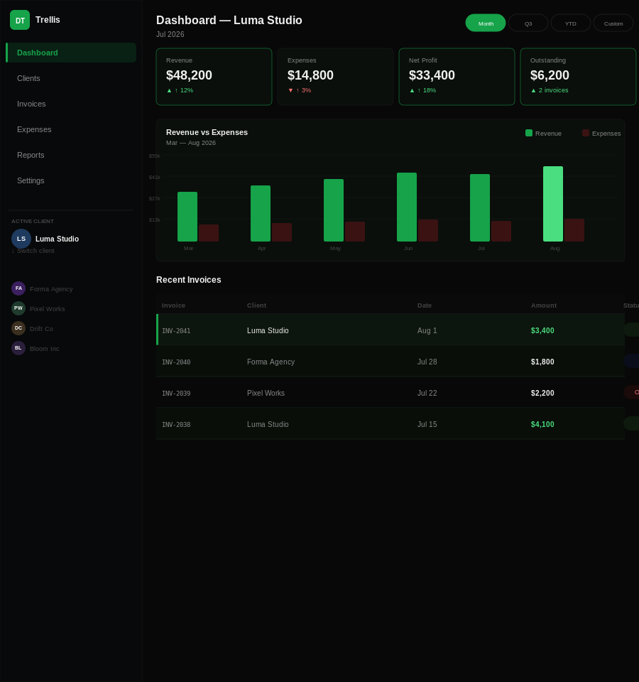
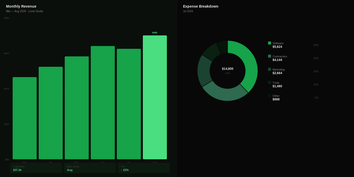
Revenue, expense, and profit at a glance. Category breakdowns, monthly trends, and client-level P&L, all on one screen. Dense data made readable through visual hierarchy and progressive disclosure.
Client Management
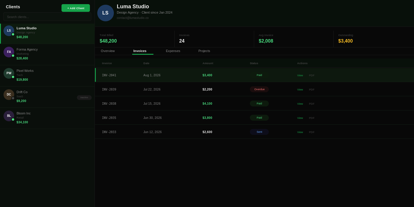
Multi-tenant client accounts with per-client chart of accounts, tax profiles, invoice history, and project tracking. Switch between clients without losing context; each account is fully isolated.
Financial Reporting
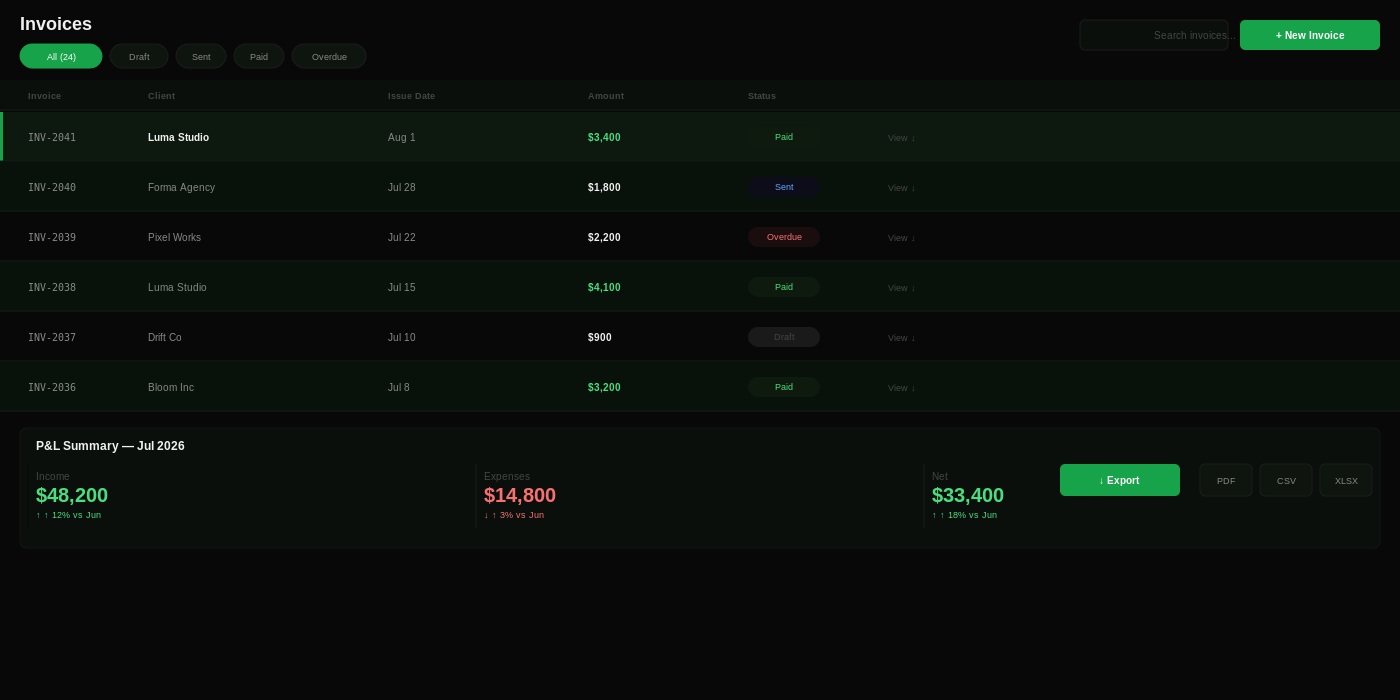
Invoice management, P&L statements, expense tracking, and tax summaries, all exportable. Every state handled: draft, sent, viewed, paid, overdue. Optimistic updates make every action feel instant.